Mar 30, 2022 -- Interface Objects
Outline
- Using Common User Interface Objects
- Steppers, Sliders, Progress Views, and Activity Indicator Views
- Image Views and Text Views
- Buttons, Switches,and Segmented Controls
- Checklist of CountDown App
Using Common User Interface Objects
- Text#1 Chapter 7
- C03-Text
- The three most common types of user interface objects are pp149
- Labels
- Text fields
- Buttons
- Using Labels - too simple, skip pp151
- Make label span across different screens
- Select
- Make it full size
- Editor -> Resolve Auto Layout Issues -> Adding Missing Constraint
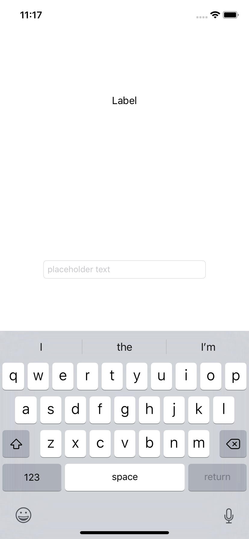
- Using Text Fields pp161
If text fields appear near the top of the screen, then the virtual keyboard can slide up.
However, if the text fields appear too close to the bottom of the screen,  your app needs
to slide its view up to keep the text field visible while allowing the virtual keyboard to
fill the bottom of the screen.
- iOS notification center pp162
- Textfield in the center, SE won't show keyboard (XR will)
- Keyboard won't go away automatically
- Dismiss keyboard not easy and
here
Right Drag to declare  @IBOutlet weak var vv_field: UITextField!

override func viewDidLoad() {
        super.viewDidLoad()
        // Do any additional setup after loading the view, typically from a nib.

    let tap = UITapGestureRecognizer(target: self, action:
            #selector(cf_dismissKeyboard))
        view.addGestureRecognizer(tap)
    }

    @objc func cf_dismissKeyboard (_ sender: UITapGestureRecognizer) {
        vv_field.resignFirstResponder()

    }
- Defining Different Keyboards pp169
- Using Buttons pp178, pp231
    @IBAction func cf_changeBtnText(_ sender: UIButton) {
       //sender.setTitle("Display", for: .normal)
        if (sender.title(for: .normal) == "Button") {
            sender.setTitle("Display", for: .normal)
        }
        else {
            sender.setTitle("Button", for: .normal)
        }
    }
Steppers, Sliders, Progress Views, and Activity Indicator Views
- Text#1 Chapter 8
- C04-Slider
- Using Steppers pp184 skip
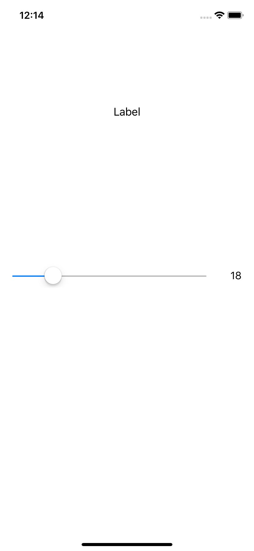
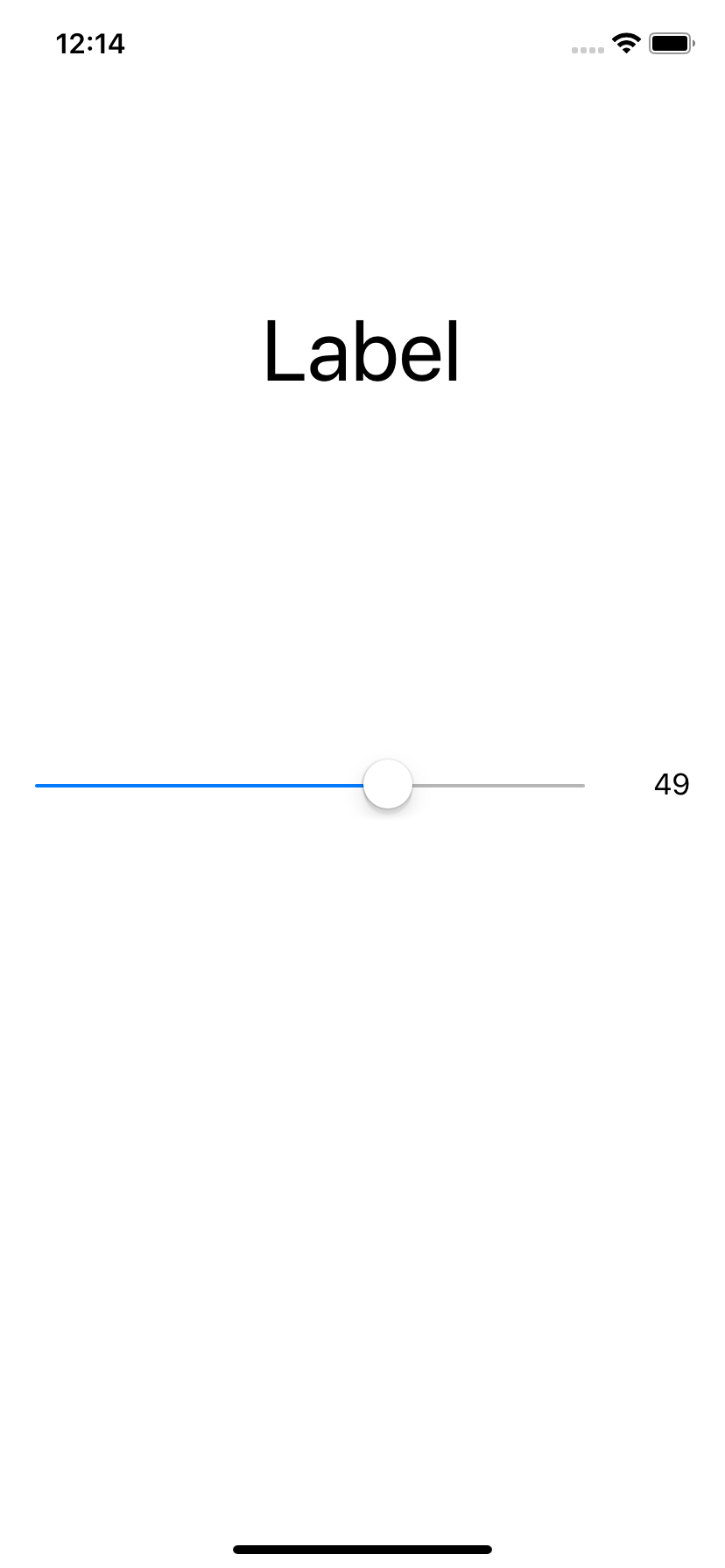
- Using Sliders pp190
- Using the Progress and Activity Indicator Views pp195 skip
Image Views and Text Views
- Text#1 Chapter 9
- Using Image Views pp205 skip
- Using a Text View pp213 skip
Buttons, Switches,and Segmented Controls
- Text#1 Chapter 10
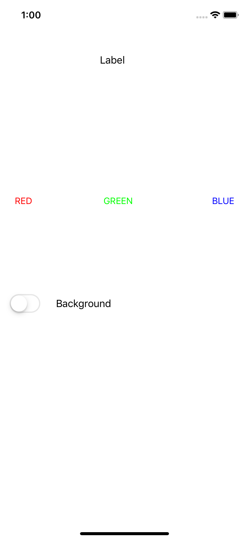
- C05-Switch
- Understanding Events pp228
- Using Buttons pp229 skip
- Using a Switch pp232
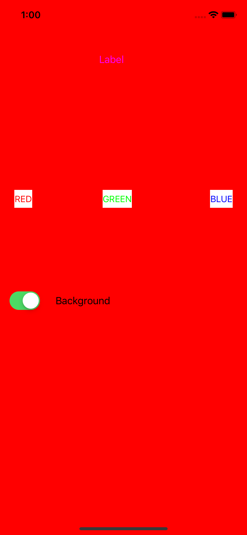
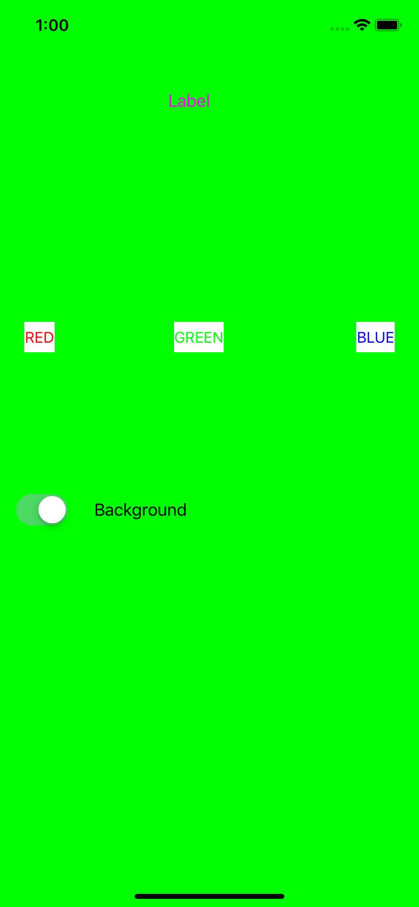
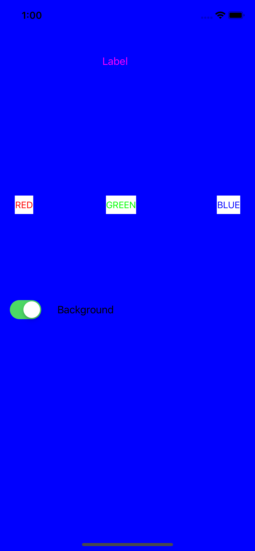
- Three buttons, one switch
- Button change either button or view background color
- Switch off resets
class ViewController: UIViewController {

    override func viewDidLoad() {
        super.viewDidLoad()
        // Do any additional setup after loading the view, typically from a nib.
        vv_btnRed.setTitleColor(UIColor.red, for: .normal)
        vv_btnGreen.setTitleColor(UIColor.green, for: .normal)
        vv_btnBlue.setTitleColor(UIColor.blue, for: .normal)
    }

    @IBOutlet weak var vv_switch: UISwitch!
    @IBOutlet weak var vv_label: UILabel!

    @IBOutlet weak var vv_btnRed: UIButton!
    @IBOutlet weak var vv_btnGreen: UIButton!
    @IBOutlet weak var vv_btnBlue: UIButton!

    @IBAction func cf_changeColor(_ sender: UIButton) {
        if (vv_switch.isOn) {
            switch sender.tag {
            case 1: self.view.backgroundColor = UIColor.red
            case 2: self.view.backgroundColor = UIColor.green
            case 3: self.view.backgroundColor = UIColor.blue
			default: break
            }
        }
        else {
            switch sender.tag {
            case 1: vv_btnRed.backgroundColor = UIColor.red
            case 2: vv_btnGreen.backgroundColor = UIColor.green
            case 3: vv_btnBlue.backgroundColor = UIColor.blue
			default: break
            }
        }
    }

    @IBAction func cf_reset(_ sender: UISwitch) {
        if ( !sender.isOn ) {
            vv_btnRed.setTitleColor(UIColor.red, for: .normal)
            vv_btnGreen.setTitleColor(UIColor.green, for: .normal)
            vv_btnBlue.setTitleColor(UIColor.blue, for: .normal)

            vv_btnRed.backgroundColor = UIColor.white
            vv_btnGreen.backgroundColor = UIColor.white
            vv_btnBlue.backgroundColor = UIColor.white
            self.view.backgroundColor = UIColor.white
        }
    }
}
- Using a Segmented Control pp236 skip
- Connecting Multiple Objects to the Same IBAction Method pp241
Checklist of CountDown App
- Toolbar buttons
- Font, color, background
- Consistent across different screen resolution
- Enable/disable button
- 'Auto run' - thread